Client: Eldorado Resorts
Project:
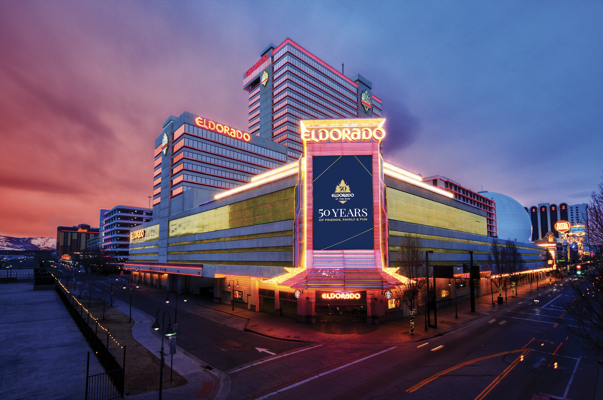
This project was to develop a high end and modern campaign to celebrate the 50th anniversary of Eldorado Reno exemplifying the core friends, family and fun values that guests can expect.
For this campaign look, my approach and thought process was to create a luxurious, high end look and feel. I started with gold thin lines that was inspired by the architectural design of the building. The gold lines allowed to make angled, stylistic containers while keeping the design fresh and modern. The background is not black, but a deep navy blue that is able to contrast well with the classic Eldorado gold and white of the logo and type. The deep navy blue color is chosen to represents trust, stability, and evokes the feeling of tradition which is what Eldorado is known for.
Copy Writer: Jeannie Garcia